Made some more icons for A Discovery of Witches. Its been a while since I've done any text work and I feel a bit rusty with it. Any concrit would be welcome.
And the banner I made for my Tumblr, but never posted.
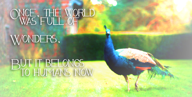


And the banner I made for my Tumblr, but never posted.
no subject
on 2019-06-09 03:11 pm (UTC)About the text: the text in 2 is too small to prevail against the busy background. My go-to technique is to simply paint a blob of color behind the text, just to make it less busy. You can always lower the opacity of the blob. It works much better in 5, because it's bigger.
Coloring is always important - the best thing is usually to pick a color from the subject and make the text the same color. Then the text looks like it's part of the icon instead of pastede on.
That's my advice for the last icon: the blue is close to his suit, but not the same. (And a little too low-contrast against the mid-blue background). It works much better in icon 1, for that reason. This is why 5 works so well, too, because the light blue contrasts well against its complementary color, orange (or beige).
Another, unrelated hint:
For printed fonts (not script, like you use here), increase the kerning - i.e. space the characters farther apart. That immediately makes them more readable.
no subject
on 2019-06-09 04:02 pm (UTC)Gah! I think you've told me that before for text and I just forgot. :( I felt completely lost trying to do anything. Thank you!